The brief
Every Birth is a platform for celebrating real birth stories — giving women a beautiful, safe space to share their experiences and connect with others. The founder came to us with an idea and a name. Nothing else. Our job was to make it real, fast.
Everything needed building from scratch in six weeks: a brand that felt warm, modern and trustworthy; editorial photography that captured genuine emotion; a waitlist site to capture early interest before launch; and a full app design to bring to early users and investors. Four things, six weeks, two people.
01 — Brand identity
We built the Every Birth visual identity around two ideas: softness and authority. It had to feel warm enough to earn trust from women in vulnerable moments, and credible enough to stand alongside NHS-linked health content.
The wordmark is set in a refined serif with a hand-drawn feel — intimate, not corporate. The colour palette centres on a warm blush and ivory, deliberately steering away from the clinical blues and greens that dominate the health space. Typography across the brand uses editorial proportions: large, breathing headlines that treat birth stories with the weight of long-form journalism.
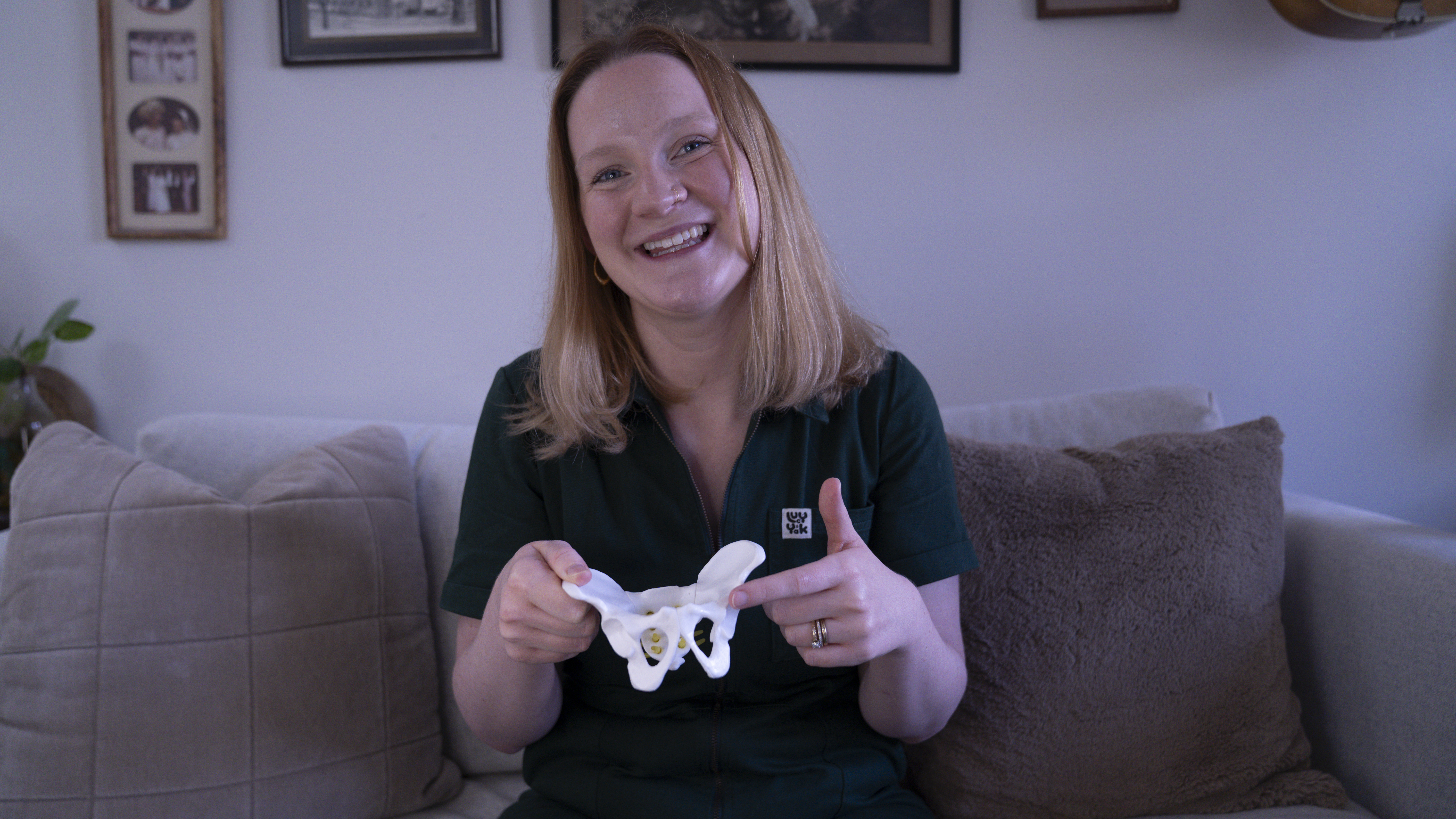
02 — Photography
The brand needed imagery that felt genuinely real. Not stock. Not styled within an inch of its life. Jamie led a full editorial shoot to create the visual library for launch — the brief was simple: natural light, real people, authentic moments.
We shot in a home setting to capture the intimacy that sits at the heart of the brand. The images were used across the waitlist site, app onboarding, social media launch, and pitch deck — giving the brand a consistent, editorial visual language from day one.
03 — The website
Before the app existed, the brand needed a presence and a way to capture early interest. We designed and built the waitlist site in a single week. One page, one goal: sign ups.
The copy leads with the problem Every Birth solves — personalised, midwife-led information that actually matches your experience. The photography creates immediate emotional connection. The form removes every possible point of friction. It went live on a Thursday afternoon.
04 — The app
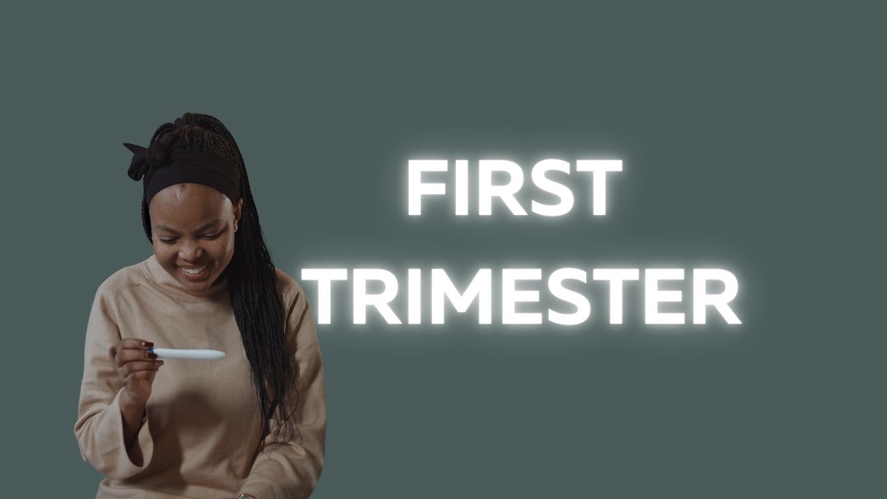
The app is the core product — a platform for women to share and discover real birth stories, access midwife-led guidance, and connect with a community of people who get it. We designed every screen from scratch: onboarding and personalisation, story feed, story submission flow, community features, bookmarks, and profile.
The design system was built directly from the brand palette, with a warm ivory base, blush accent, and clear typographic hierarchy that makes long-form content genuinely readable on a phone. Every interaction was considered: how do you make someone feel safe enough to share something this personal? That question drove every design decision.
The result
The waitlist went live on a Thursday. By the following Monday they had over 2,400 sign-ups — zero paid advertising, purely organic sharing in communities where the brand genuinely resonated. The photography ran across launch posts, early press coverage, and investor pitch decks. The app design gave the team a complete, tested vision to bring to their first round of users and funding conversations.
Four deliverables. Six weeks. One cohesive thing.
"Whitecliff took what was in my head and made it real. The brand, the photos, the website, the app — it all felt like one cohesive thing from day one. I don't know how they did it in 6 weeks." Founder, Every Birth